
7 Gallery Wall Ideas That Actually Look Intentional
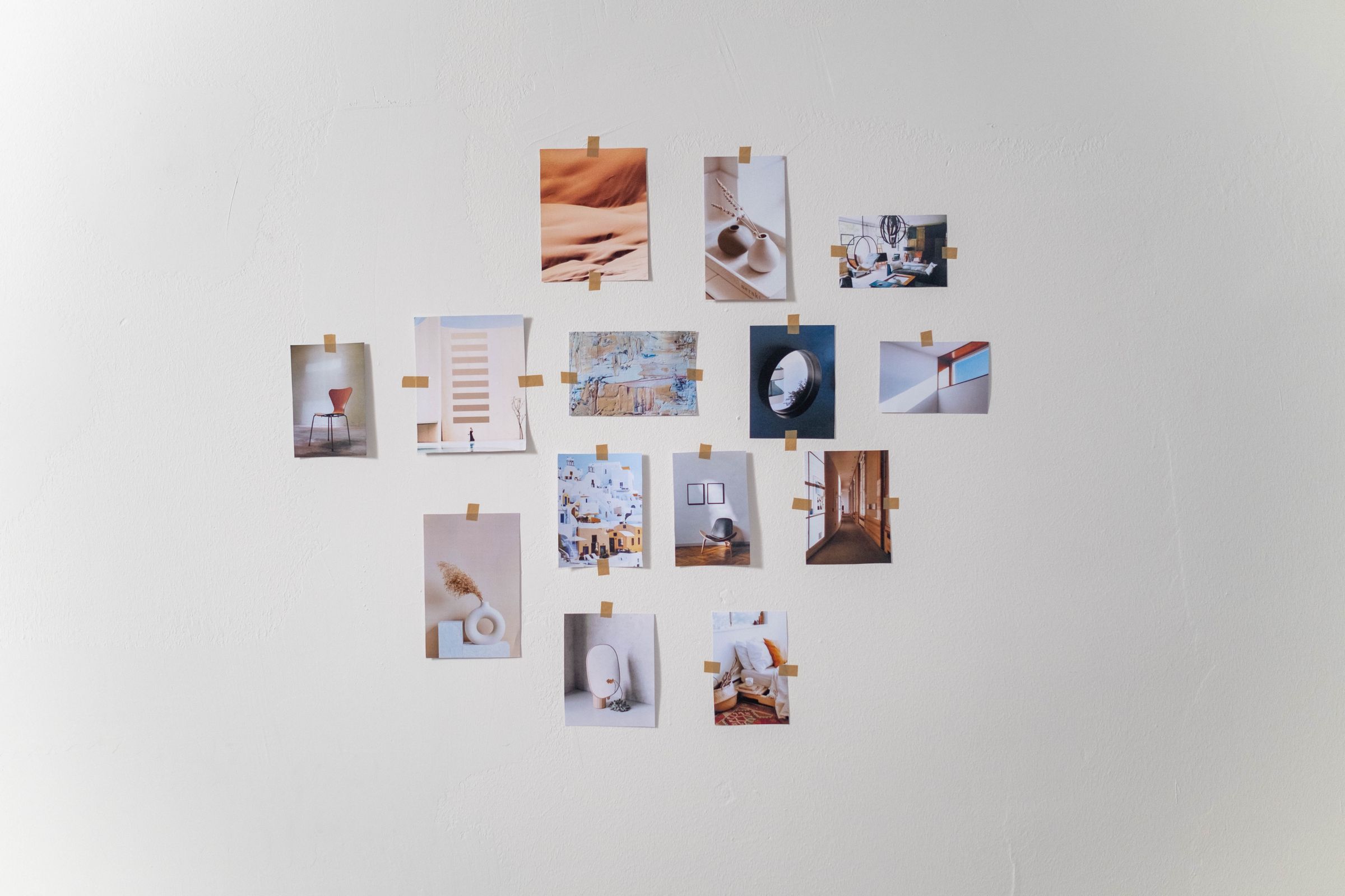
A gallery wall is one of those projects that looks effortless when it’s done well and looks like a mistake when it isn’t — and the difference almost never comes down to the art itself. It’s the planning underneath it. Here are seven things that separate a wall people stop and look at from one that just has a lot of frames on it.
1. Plan It on the Floor Before You Touch the Wall
The single biggest mistake is hanging frames one at a time and adjusting as you go — by frame four, the spacing is already off and there’s no clean way to fix it without a wall full of extra nail holes. Lay the whole arrangement out on the floor first, step back, photograph it from above, and only start hammering once the layout actually works on paper.
2. Pick One Consistent Spacing Rule
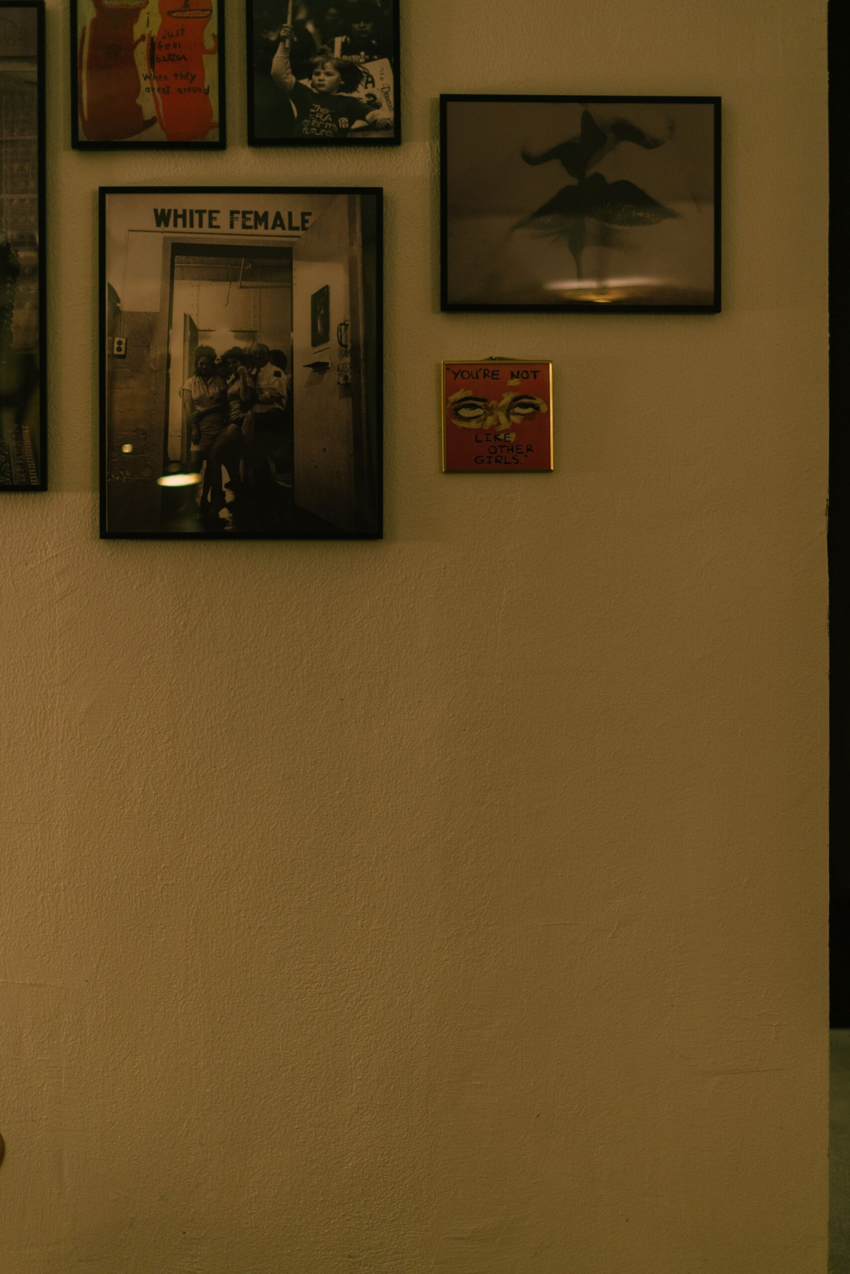
Uneven gaps are what make a gallery wall read as cluttered instead of curated. Pick one spacing — 2 to 3 inches between frames is the standard that works for most rooms — and hold it everywhere, even when it means a slightly awkward gap near the edge. Consistency reads as intentional; “close enough” reads as accidental.
3. Mix Frame Sizes, Not Just Frame Styles
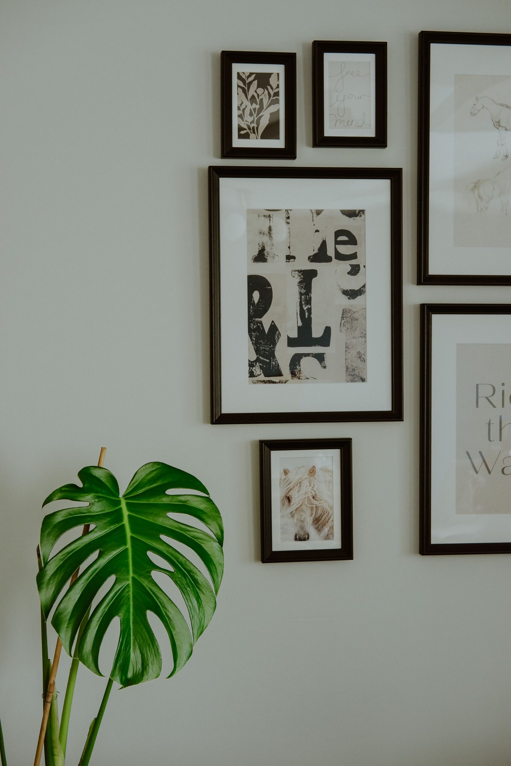
A wall of same-size frames in different colors still looks flat. The visual interest comes from mixing scale — one or two large anchor pieces, a handful of mid-size frames, and a few small ones tucked into the gaps. Let the large pieces carry the composition and use the small ones to fill and balance, not to lead.
4. Anchor the Layout Around One Piece
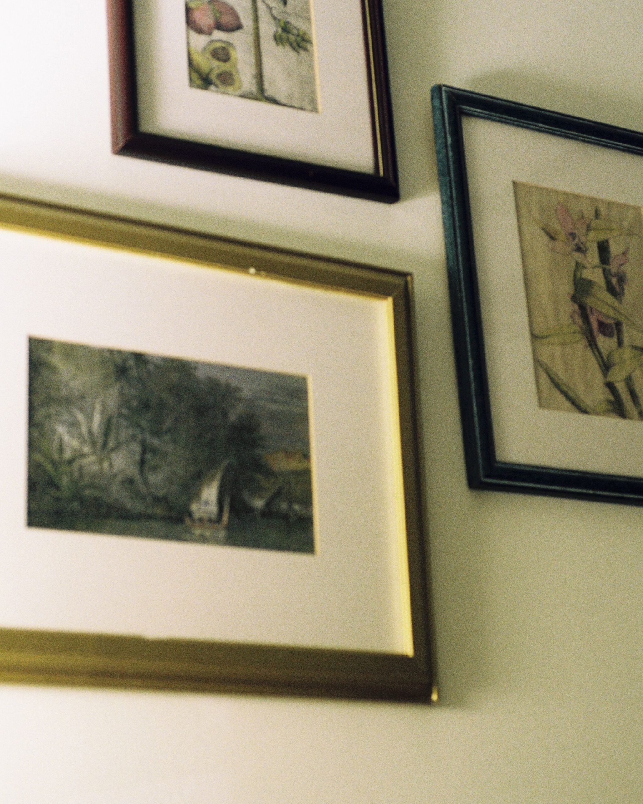
Every gallery wall needs a piece the rest of the arrangement is built around — usually the largest or most visually heavy one. Hang it first, roughly at eye level, and build outward from there. Without an anchor, the eye has nowhere to land and the whole wall reads as a scattered collection instead of a composed one.
5. Keep a Consistent Color Thread
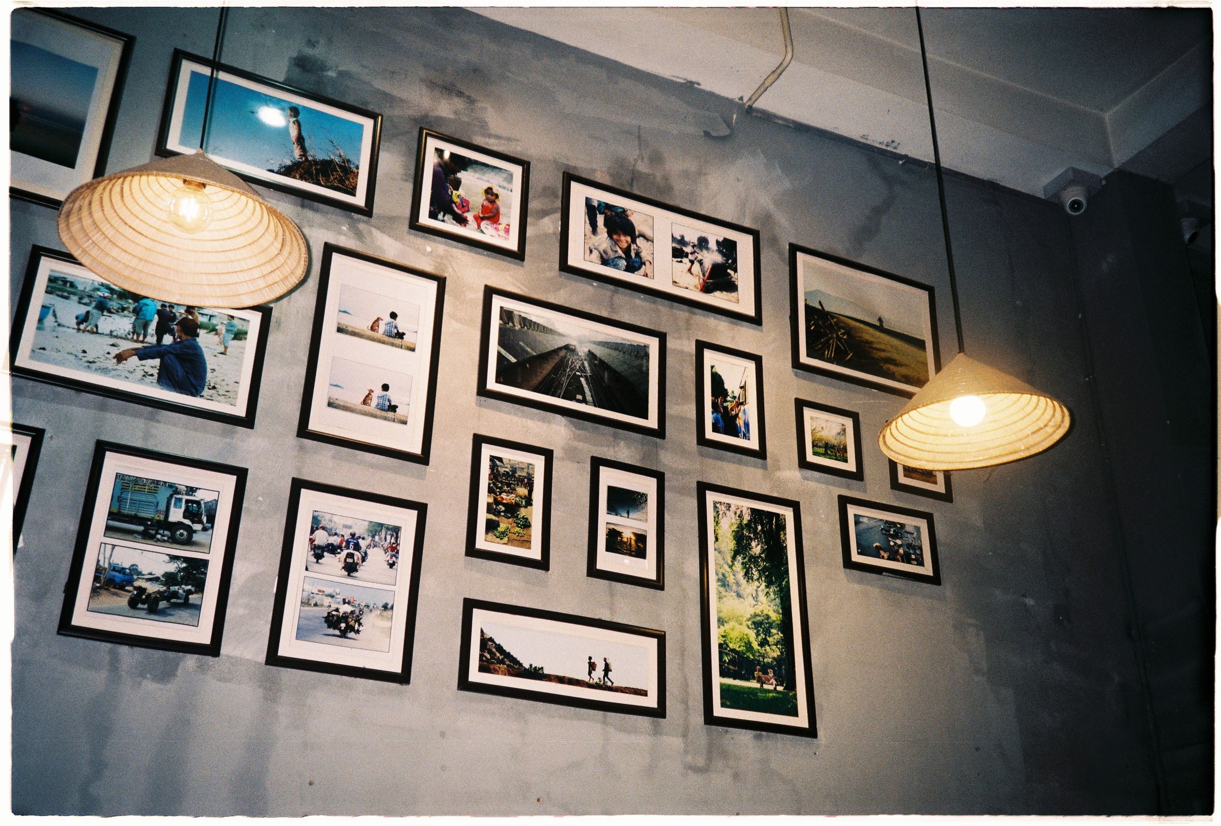
Frames don’t need to match, but the wall needs some kind of thread holding it together — a shared frame finish, a limited color palette in the art itself, or a consistent mat color. Two or three matching frame finishes scattered through an otherwise mixed set does more for cohesion than any single expensive piece.
6. Use the Low-Commitment Layout Trick

Before committing to nail holes, trace each frame onto kraft paper, cut out the shapes, and tape them to the wall in the planned arrangement. It takes twenty extra minutes and completely removes the guesswork — you can move paper templates around for free in a way you can’t move actual nail holes.
7. Leave the Wall Room to Grow

A gallery wall planned to fill every inch of available space has nowhere to go when you find a new piece you love. Leave a little breathing room at the edges on purpose — it keeps the wall from feeling overstuffed now and gives you somewhere to add on later without redoing the whole layout.
Common Mistakes to Avoid
- Hanging frames one at a time without a plan. Spacing drifts and there’s no clean way to correct it after the fact.
- Uniform frame sizes throughout. Mixing scale is what gives the wall visual depth.
- No anchor piece. Without one large piece to build around, the eye has nowhere to settle.
- Filling every inch. A wall with zero breathing room can’t grow without a full redo.
FAQ
What height should the center of a gallery wall sit at?
Around 57–60 inches from the floor to the center of the arrangement — roughly eye level for most standing adults, the same rule galleries use.
Do all the frames need to match?
No — mixed frames usually look more intentional than matching sets, as long as there’s a color or finish thread tying a few of them together.
How much spacing should be between frames?
2 to 3 inches is the standard that reads as clean without looking sparse; stay consistent across the whole layout.
Final Thoughts
A gallery wall comes down to planning, not talent — lay it out before you commit to a single nail hole, anchor it around one strong piece, and keep the spacing consistent throughout. Everything else is just filling in the gaps.